SoundCloud
Rethinking a popular music platform mobile experience
Overview
I have been using SoundCloud for a while, and in my opinion, the interface could use some work, as it is not very user friendly and makes the product less enjoyable.
As a personal project, I decided to try my hand at redesigning some of the screens to make it an overall better experience for users. My goal was not to reinvent the wheel, but study competitor music platforms and come up with a solution to improve the user experience.
ROLE
Visual & UX Designer
TOOLS
Sketch & InVision
TIMELINE
Jan - Feb ‘20
Problems
After testing out the application on both iOS and Android, I found the SoundCloud to be difficult and confusing to use. I also met with a few of my peers who use the app and we highlighted some of the key problems:
Home screen is overcrowded & lacks visual hierarchy
Accessing a user’s personal music library takes way too many steps
Clunky navigation, messy user flow
Solutions
The whole user flow needed to be redone. I studied competitor apps like Spotify, Deezer & Apple Music, outlined the necessary changes to make this platform useable and enjoyable for an average music enjoyer.
Redesign the home screen with a cleaner layout and removing unnecessary features
Rethink the Now Playing interface for a smoother listening experience
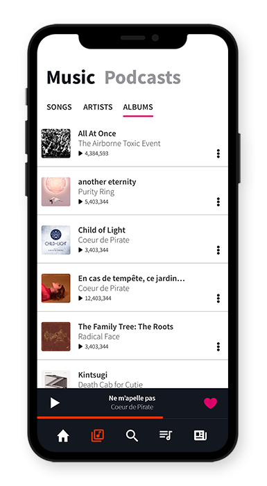
Reorganize the music library and make it easier for the user to access their favorite tracks & playlists

Wireframes
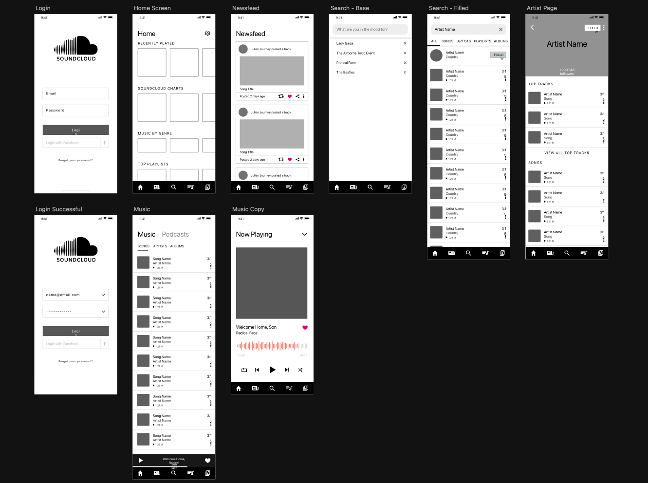
I started out by laying out all the different screens, using the current app as a guide while reorganizing elements in a way that made sense to users. The goal was to clean things up and get an idea of how all the different screens would work.
High Fidelity Mockups
Homescreen
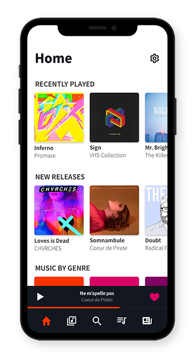
The home screen now features recently played songs at the top, new releases, music by genre and recommendations for the user to browse through.
The bottom navigation has been redesigned as well, giving the user easy access to the search function, their personal library and the queue.
Now Playing
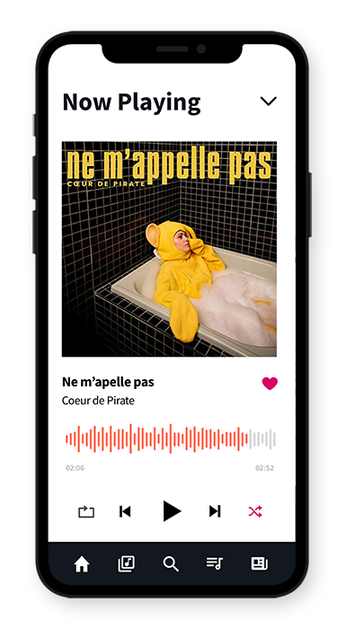
The Now Playing screen has been cleaned up to have less clutter while providing the users an easy player allowing them to easily play, pause, skip shuffle or repeat.
The interface has been reimagined to include the current album cover as the main visual, while also keeping the song information and giving the option to favorite songs right in the player screen
Music Library
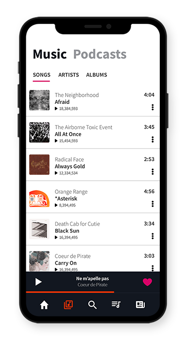
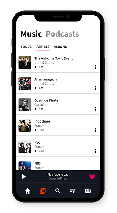
The music library can now be accessed in the bottom navigation, by tapping the icon next to the home icon. All of the user’s personal library is all in one place and they can easily switch tabs to access songs, artists or albums.
Additional Screens
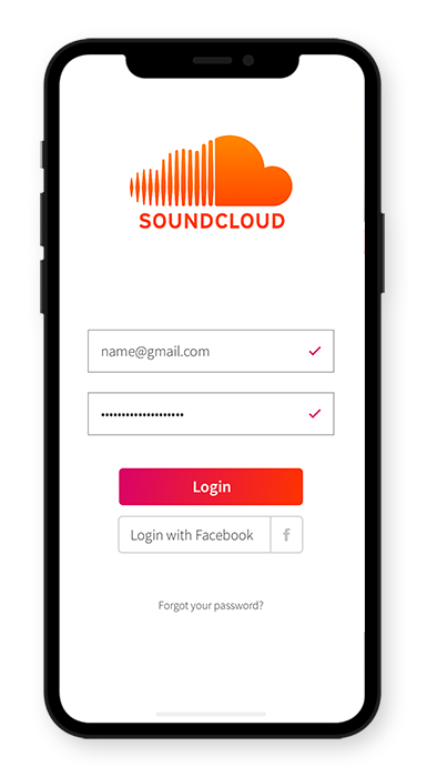
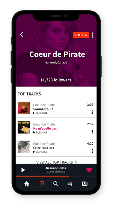
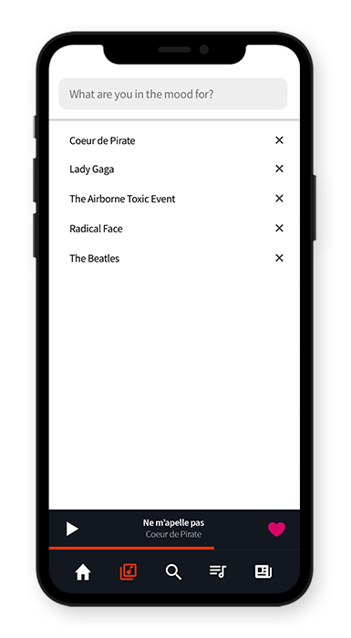
While I was at it, I also redesigned the login page, a sample artist profile and the search screen in coordination with the rest of the interface look.